To Boldly and Beautifully go…
From iPhone photo to huge colour paper prints, iPhone artist Barbara Braman shares her workflow in this fascinating process of how she translates her digital images into luscious, colourful bold images on paper.
While browsing the iPhoneographyCentral Flickr group a few weeks ago, one woman’s work really stood out in the Flickr Group. Barbara Braman’s incredibly beautiful bold and colourful images really took my breath away and after doing a little research, I was delighted to discover that she had also taken the trouble to learn a thing or two about printing and get her images, where they should be, out of the phone and into the real world by way of magnificent full-colour prints.
By sheer coincidence, my second joyful discovery shortly after seeing her work for the first time was that my iPC partner writer, Bob Weil had picked Barbara’s image to feature on our weekly showcase, Apps Uncovered so make sure you see more her work (and Flickr stream by clicking on her image in the showcase)
Many of us take hundreds of pictures which unfortunately never leave our phones. I believe, as artists we should all aim to see our work in print – the true test of the art if you like – but this is often a sticking point as most of us know, printing our work is no easy task and for those of us who have been brave enough (and have the budget) are bound to be disappointed with the results given the discrepancy between how an image looks on a brightly back-lit screen and how the same image looks printed in ink absorbed onto paper.
Barbara Braman has taken the “printing plunge” and the world is all the better for it. In the following article she shares her complete workflow from initial photo taken with the iphone and talks us through various creative decisions along the way resulting in beautiful variations of the same image. Concluding with the final printing process, Barbara includes some great general tips that will hopefully break down some fears and barriers you may have about printing your own work.
Thank you Barbara for sharing your wonderful work and workflow. Over to you…
“The first thing I love about digital art is that I can do it anywhere, whether I am riding the bus, waiting at the doctor’s office, having a cup of coffee in a coffee shop, or home with a few minutes of downtime. I can take a picture anywhere of whatever catches my eye and I can transform it on my phone.
I can start with a photo of a stack of magazines and end up with an abstract of rectangular shapes. I can sketch someone or something. I can edit a picture from my camera roll that takes it in a whole new direction. These are all quick things to do. If I have more time or come back to it, I can combine all these pictures in a collage. I can do all of this on my phone. These are, in my mind, all sketches.
The second thing I love is that later, if I like what I did, I can refine the ideas, tweak the colors, add – or more likely – subtract parts to find the essence of the image. I don’t always start out knowing what I want to say or show, I find that it develops as I am working. If I continue to be interested in the image, I keep adding things until I get the message. Then I spend another few rounds taking out everything that distracts.
So, the digital workflow is for me a process of building the image up then paring it back. I make a number of different versions of the same subject. Recombining and simplifying as I go.
So, the digital workflow is for me a process of building the image up then paring it back. I make a number of different versions of the same subject. Recombining and simplifying as I go.
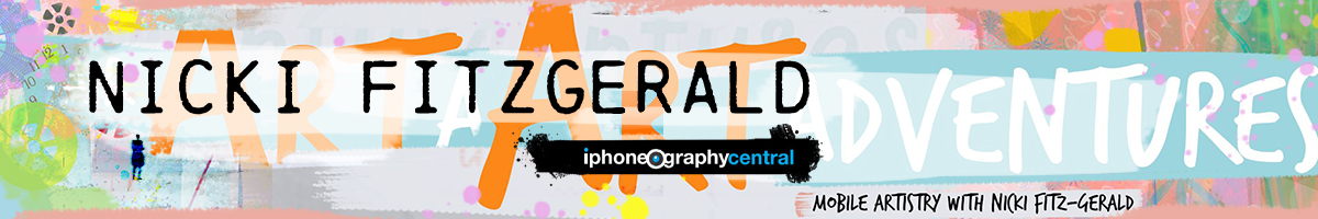
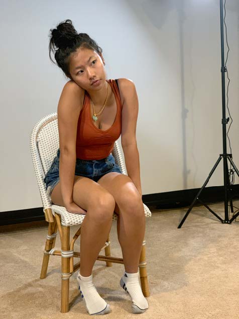
Recently, I have started to learn how to light a model and to adapt that for use with my iPhone and a manual camera app: Camera+ 2. A friend helped me unpack and set up the lights and his daughter patiently sat while he showed me a couple of light set ups and we learned how these particular lights worked. None of the pictures were particularly good. I hadn’t gotten to the point where I had learned about camera settings, but one of the poses caught my attention. I liked everything about the pose. Later, I realized that the important aspects were shape of her shoulders, her head angle, her white socks. She seems sad and uncomfortable, but somehow patient.
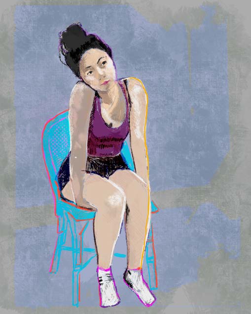
So, I started with Procreate and a traced drawing that I filled in. I was interested in the light and how it fell (that’s what I am trying to learn to do) and also the expression of the pose. I am drawn to simplifying and flattening my images and letting the form and color do the talking. I learned a lot from this particular iteration but it was not what I was interested in as a final product. I could not have made the final versions without this one. I feel that in drawing it from my photograph, I inhabited the pose and its feelings. But I knew there was a better way for me to express what I felt.
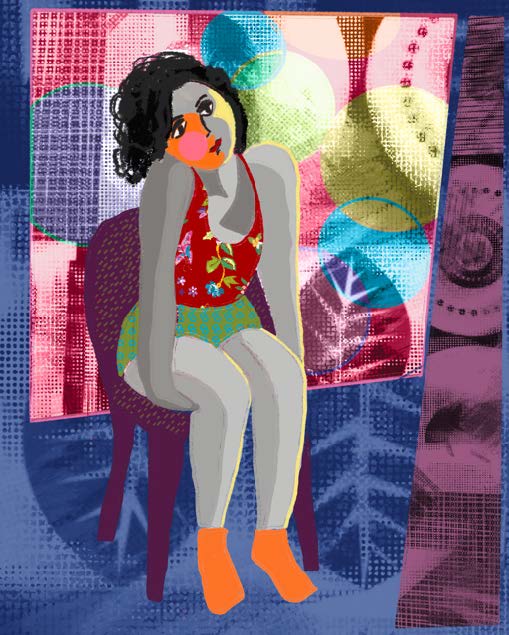
In the next version, also using Procreate, I start flattening the image and defining the space. There was a lot that I liked about this version, particularly the way I created a space for her to be in. But it was just the beginning of the transformation. At this point I added a backdrop to define the space, but I also see that I was losing focus on the pose, and for me the pose is key to the expression of feelings in this image.
I added an abstract I did a few years ago to define the background wall, and shadowed shapes to the floor. I simplified the abstract in iColorama, and tweaked the colors in Procreate. I also added modeling to the girls figure. Back and forth with flatness and dimension. I am unsure of how I want it to go.
The next image is a simple tweak of the planes in the app Glitché. I am honing in on what it is about her pose that I want to convey. It isn’t just her sadness and patience. It is about her being in an uncomfortable place and feeling disjointed. I really like how this effect works to communicate that. But I do not like how the background, which I think is beautiful, and the colors, also beautiful, are taking over the picture. I need to rethink and go back to basics.
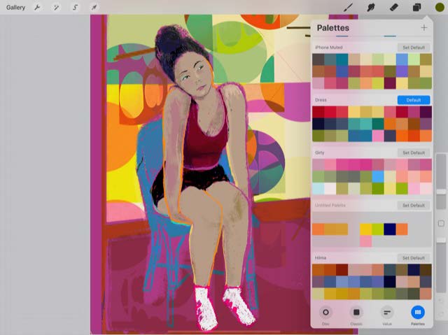
Here is another part of the digital art work flow that I love. I love building palettes in Procreate. I have a bunch. I build them from my photographs, a photo of a pice of fabric, a painting, or a color that I like. When making a palette from another image, I choose the colors I want from the image and add them to a palette. It is the same starting with a color. I start a palette and play until I have a range of colors that I think make sense together. As I am using the palette I add new colors to it.
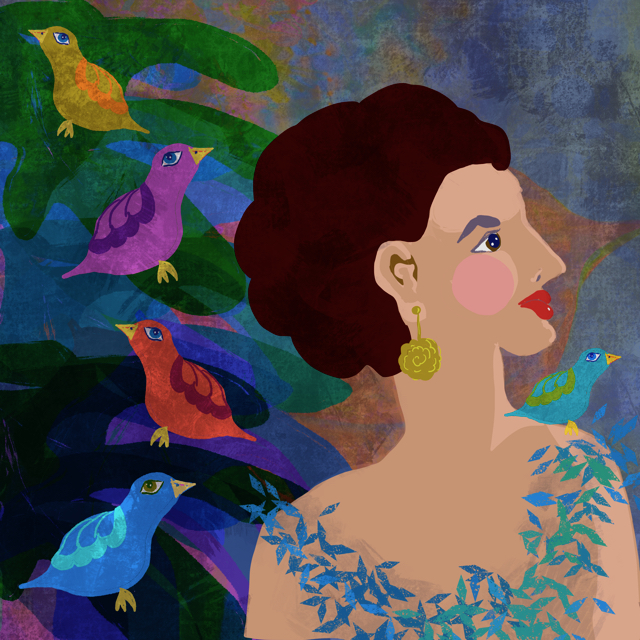
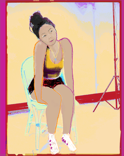
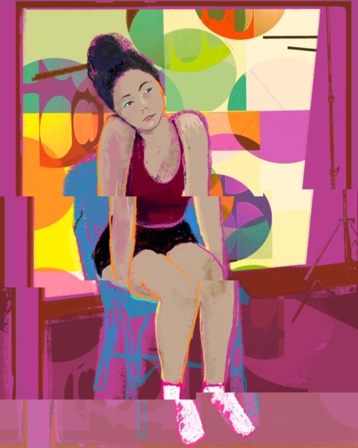
For the next iteration, I used a palette I call “iPhone Muted” because I built it on my iPhone and I wanted to use what are muted colors for me. I wanted the figure to really stand out, so used bright yellows and oranges from another palette. I redrew the shapes and simplified them. I kept the edges rough by drawing the shapes with the dry ink brush. When I filled the shapes using the drag and fill feature, I kept the tolerance low so it would leave a little outline in the filled shape. I was happy with this, but decided it was now too simple.
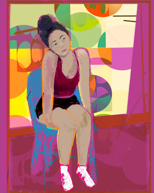
The abstract had given her a busy world to inhabit. But it was too busy. I drew some patterns into the shapes to give her world more complexity. This strengthened the mood. The wheels and shapes in the background contrasted with the stillness of the figure and highlighted it. I wanted to show just how off kilter she was, so went back into Glitché and separated the colors and planes.
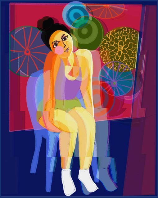
I brought the Glitché image back into Procreate, to maintain resolution and to add some details. This is where I wanted to go with this image and I am happy with it.
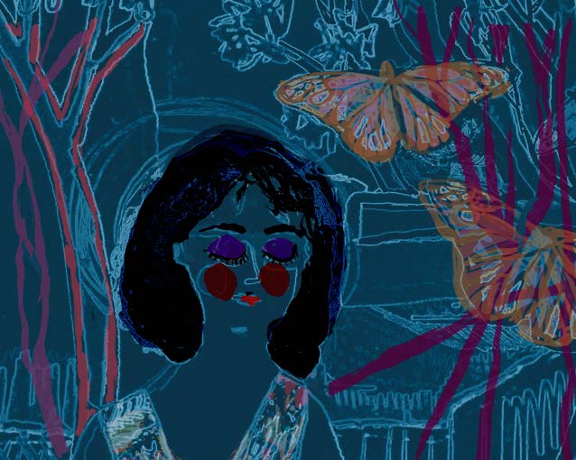
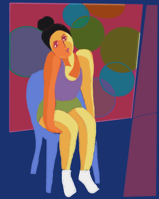
The third delight of the digital workflow happens now. I have an image I love. But what else can I do with it? Here are a couple of the subsequent images that I developed over the next few days. I find that in taking an image even further, often a totally new image results. I got one that I liked, and another one that I loved. In this iteration, I try complicating the background and draining the color out of her. She is separated from the goings on of the world visually and emotionally. At this point I changed her hair also. It became a self portrait and expressed my feelings at that moment.
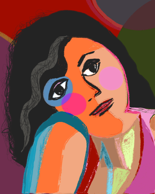
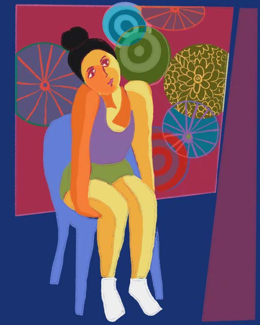
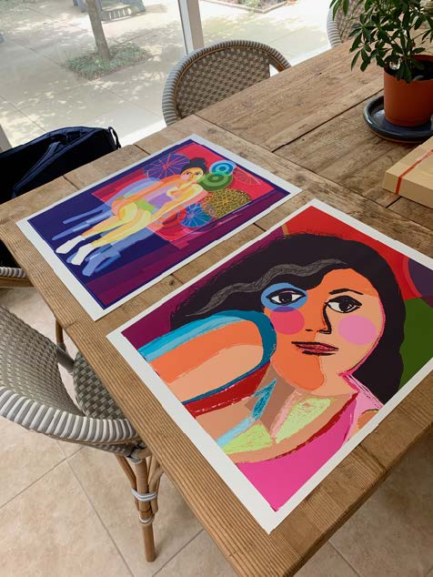
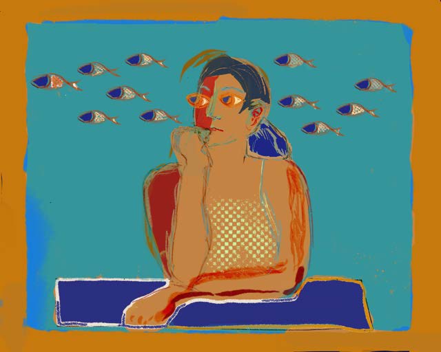
In this last iteration, I zoom in on just the head and the gesture of the shoulder. I simplify the shapes further. It ends up being my favorite of the images. I decide to print two of the images. This one, and the off kilter image that I initially loved.
Printing the images
I do not print most things that I make. I print images that have been accepted into exhibits. I also curate shows at our local coffee shop, and print for that. Sometimes I print just because I want to have an object form of that image. Printing is not my favorite part of the workflow. It is tricky and not intuitive. I’ve worked hard to become a better printer taking classes from Epson and from Adobe Creative Live.
To successfully print from a mobile image, I start by setting my iPad and iPhone up to make images that are easy to print. I turn the brilliance of the screen down by 1/3 to 1/2. At first this seems a terrible thing to do, the screen colors were so brilliant and now seem dull. But these new colors are the ones that will print accurately. So it makes sense to build the images from colors that can print. This has to do with the difference between colors made out of light and backlit as we have on the screen and the colors made out of ink and laid down on paper. It is possible to get amazing brilliance, but you have to start with reasonable expectations. Turning down the light in the screen does that. I am also always mindful of what the apps are doing to the resolution size of the finished picture. If apps have degraded the size, I am likely to finish up in iColorama or Procreate so I can maintain resolution for printing.
From iPad to computer
I then send my images to my computer and open them in Lightroom. I use Airdrop to send the
images. It’s the easiest way to send a full resolution image.
Getting the color right
Color is the most important element in my images so I have color calibrated my monitor using a Color Munki. This ensures that the colors I see are the colors that will print. This is not an absolute guarantee, but it saves me from a lot of mistakes, preserving paper and ink. It can still take me a few proofs to get the color exactly right.
I use matte papers to print. My favorites are Epson’s Ultra Premium Presentation Matte and Museo’s Portfolio Rag. To print successfully on a paper, you must have the right instructions installed. These instructions are called ICC Profiles, and are available from the paper manufacturers.
In Lightroom, I open the image and choose develop. I “soft proof” the image. To do that hover the curser over the histogram and type an “s”. Lightroom will then give you a choice of papers whose profiles you have installed and you choose the one you are going to print on. The colors you see on the screen will change when you do this.
After this, I just lean my iPad with the image displayed up against the monitor and work to match the colors. Almost always I need to use a brighter exposure, and often boost the colors. Lightroom also lets you work on each color separately. Less adjustment is always the goal, but sometimes subtle tweaking is needed to get a color where it needs to be.
After the image looks right, I go to the print module. Here is where I choose the paper size, the image size and the paper type. I make sure I have selected the right ICC profile for the paper.
The final print
I use a 10 year old Epson 3880 to print. I first run a test print. I usually print 16X20. For the test print I have smaller 8X10 versions of my papers. If I am concerned about the relative sizes of my lines or how an image will look scaled up to 16X20 from my iPad screen size, I might run the test on a full size sheet.
Sometimes that’s all it takes! More often, some small adjustments to the exposure and some of the colors is necessary. When I get a print I like, I name it and save it so I can print it again. My digital workflow is a joy because of its flexibility and variety. In this article, I walked back through a recent series of images and explained the flow of ideas and apps I used to create two finished works. This set of images was made almost entirely in Procreate. I like that app because I enjoy drawing and adding composite pieces. I can adjust layers against each other again and again, achieving the color and placement that I desire. Other days, the image might demand a more intensive edit in iColorama with little or no support from Procreate. Other apps I use currently include Imaengine, Glitché, Snapseed, Focos, and Touch/Retouch.
The biggest joy of all…
Every day is different with a whole new set of ideas and apps to express them. I tend not to take pictures with a specific goal in mind. It is later when I am reviewing my camera roll that I choose an image and begin to work on it. Something in that image made me notice it on that day. But, it is in the working that the meaning is made. And that is the biggest joy of all in the digital workflow.”
See more of Barbara’s work:
Instagram: bee_dobbs
Facebook: Barbara Braman: Art & Photography
Website: barbarabraman.com